
When designing a website or creating a visually appealing digital project, choosing the right fonts can make or break the aesthetic. One font pairing that strikes a balance between sophistication and readability is Lora and Source Sans Pro. This versatile combination blends classical serif elegance with modern sans-serif clarity, making it perfect for a range of applications.
In this article, we’ll explore the beauty of Lora and Source Sans Pro, why they work so well together, and how you can use them to elevate your design, particularly for Web Design in Sri Lanka.
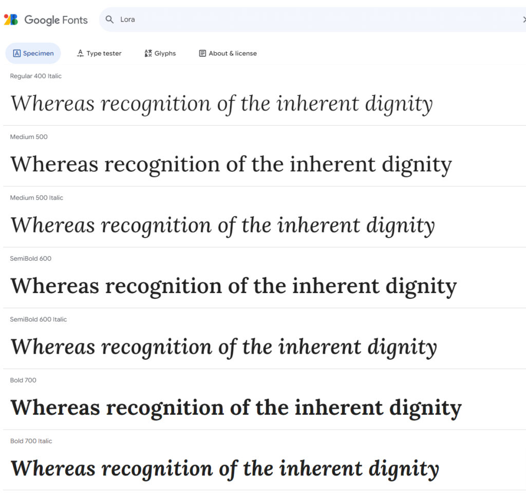
Lora: Classic Elegance with a Modern Twist
Lora is a beautiful serif font with roots in calligraphy, offering a sense of formality with a touch of artistic flair. It was designed by Cyreal in 2011 and has quickly become a favorite among designers due to its harmonious balance between traditional and contemporary styles. The subtle curves and organic strokes give Lora a sense of warmth and elegance without being overly ornate.Best uses for Lora:
- Headings and subheadings where you want to add sophistication
- Long-form text in print or digital formats that require a touch of classical beauty
- Design elements like pull quotes or product descriptions that need emphasis
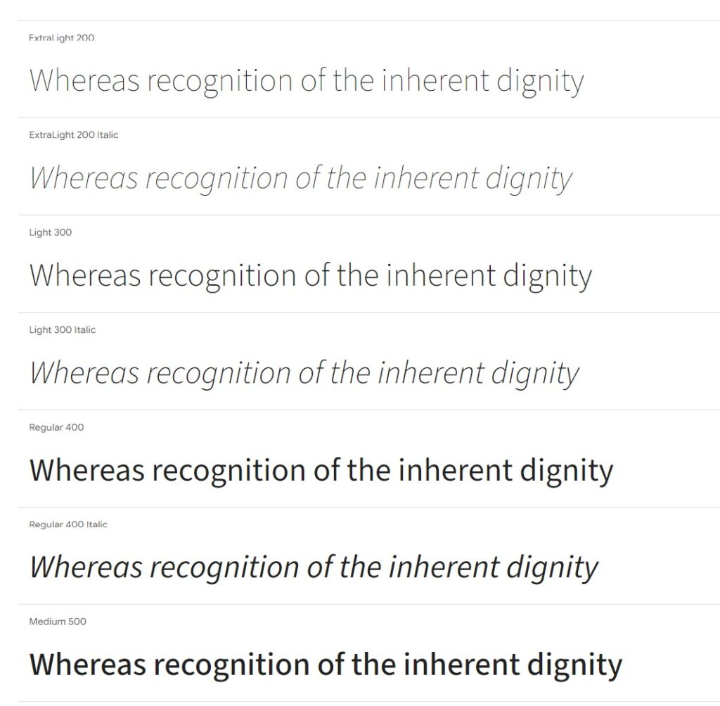
Source Sans Pro: Modern, Clean, and Readable
While Lora provides elegance, Source Sans Pro—created by Paul D. Hunt—brings a modern, clean look that ensures readability and clarity. As Adobe’s first open-source typeface, it was designed specifically for user interfaces but has since become a go-to choice for body text across many digital platforms. Source Sans Pro’s balanced proportions and legibility make it ideal for body copy in long-form content or small text sizes. The geometric forms give it a subtle modernist feel, making it an excellent counterpart to the more traditional Lora.Best uses for Source Sans Pro:
- Body text, where clarity is key, especially in digital contexts
- User interfaces, web forms, or mobile apps that need clean typography
- Footers, menus, and any text that should not compete with primary visual elements
Why Lora & Source Sans Pro Work Well Together
The pairing of Lora and Source Sans Pro strikes the right balance between the classic and the contemporary. Lora’s elegant, high-contrast serif details provide a refined touch, while Source Sans Pro’s straightforward simplicity offers a neutral grounding. This combination is perfect for projects that need a hint of luxury without compromising readability and clarity, making it a great choice for web design in Sri Lanka.Key reasons this pairing works:
- Contrast: The decorative nature of Lora contrasts with the minimalism of Source Sans Pro, creating a visually dynamic design.
- Versatility: This font duo can be used for anything from blog posts to e-commerce sites, adapting to both formal and casual tones.
- Balance: While Lora adds flair to headings and titles, Source Sans Pro ensures the main text is highly readable, even on screens.
How to Use Lora & Source Sans Pro in Your Design
Here are some practical ways to use this font combination effectively in your next project:- Headings & Subheadings: Use Lora for your H1 and H2 headings to make a statement. Its elegant curves and bold presence will draw attention.
- Body Text: Source Sans Pro is perfect for paragraphs. It’s highly legible even at smaller sizes, ensuring a smooth reading experience across devices.
- Call-to-Action: Want to emphasize buttons or important links? Use Lora in bold to catch the eye, or keep it simple with Source Sans Pro for a minimalist approach.
- Quote Blocks: Styling quotes with Lora adds a sense of importance and style, while keeping the overall design cohesive with Source Sans Pro for secondary text.
- Menus and Footers: Source Sans Pro is an excellent choice for navigation bars, menus, or footer text—where simplicity and legibility matter most.


